Little Pond
A little warmth. A world of possibility.

Childcare resources for parents and providers.
The beginning
A public resource.
A personal welcome.
As a new entity established by the state of Georgia, Little Pond needed to feel approachable rather than like another stale government initiative. We were brought on to provide creative direction and build the brand from the ground up.

The identity
Simple shapes.
A familiar feeling.
A home anchors the mark. Soft, organic shapes and a warm green palette give the identity a friendly character, with sunshine yellow and bright blue adding energy.

The visual language
Room to play.
Easy to read.
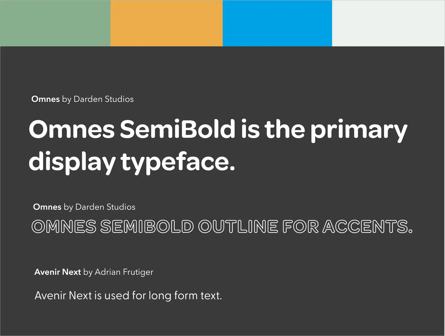
Rounded lettering, expressive shapes, and a clear hierarchy carry the welcoming tone across the brand.


The website
From a friendly identity
to a useful resource.
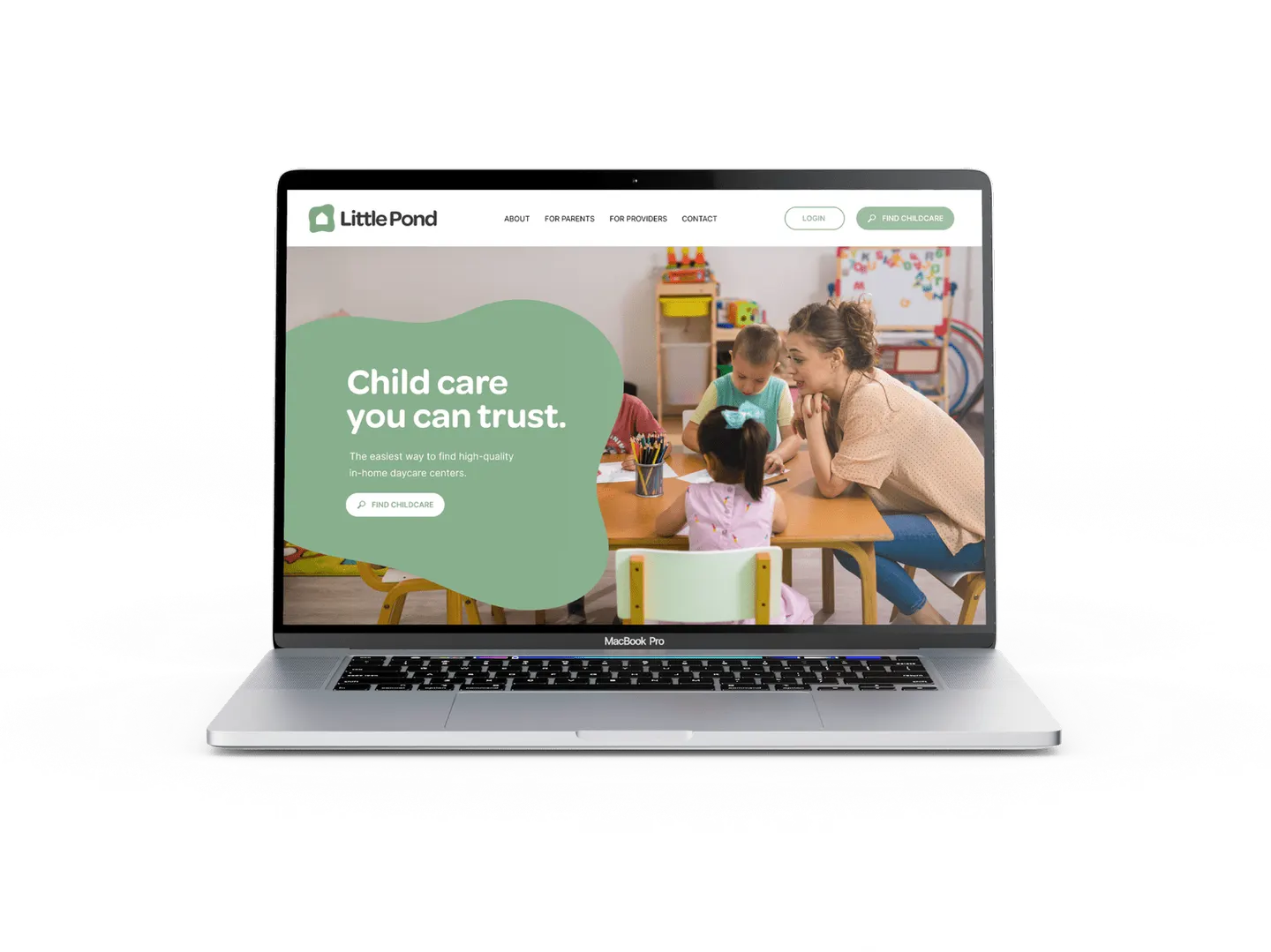
The website direction brings the same approachable shapes, colors, and photography into a digital home for childcare resources.
The brand in practice
Small details.
A consistent welcome.
The identity’s shapes and color carry through the supporting artwork, keeping the message rooted in care, community, and connection.