Lingk
Connected by design. Built for innovation.
Unparalleled data innovation.
The partnership
A connected identity.
A new creative direction.
We were able to provide design solutions and creative direction for Lingk’s rebrand. This included working closely with the marketing team to conceptualize and design the graphics and illustrations that would set the tone for the overhaul.
The identity
Many parts.
One recognizable mark.
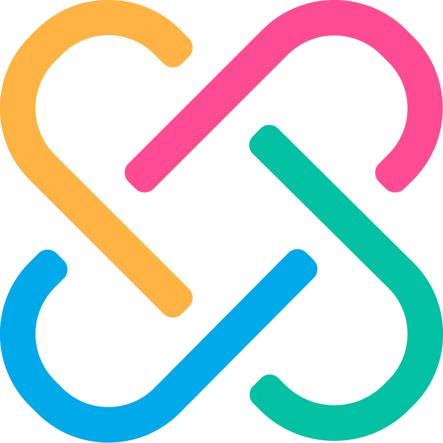
The interlocking symbol gives connection a clear visual form. Four bright colors bring energy to the mark, balanced by a deep navy wordmark.
The visual system
Bright accents.
A consistent voice.
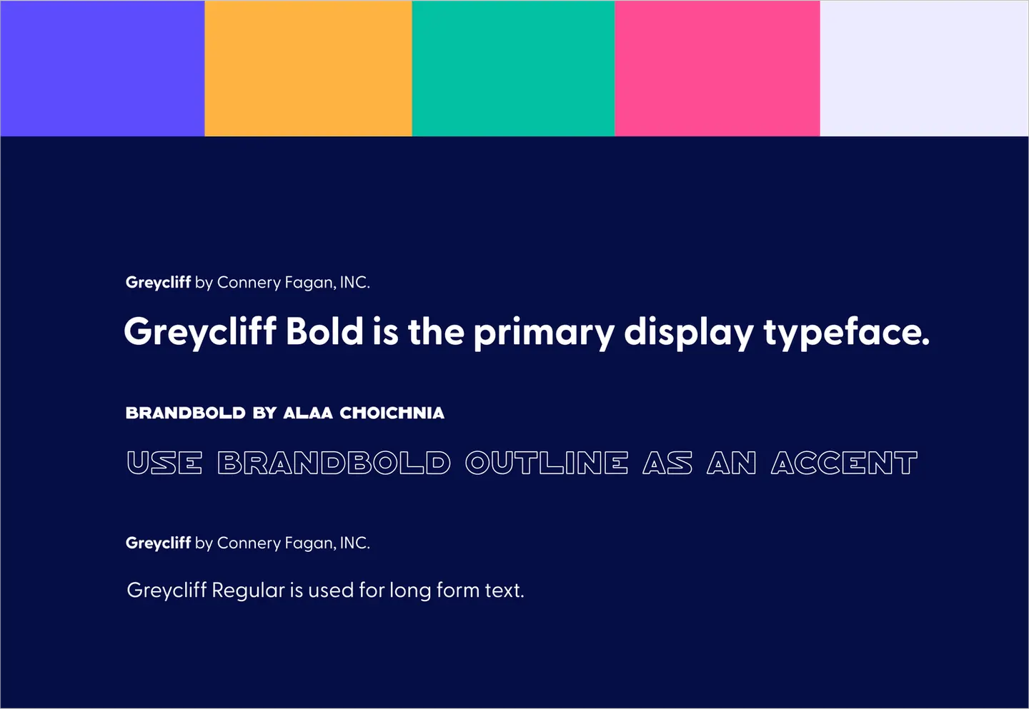
A vivid palette and bold display type create a flexible foundation for the rebrand. Light lavender backgrounds give the illustrations room to breathe, while navy anchors the supporting content.
Illustration
Complex ideas.
An approachable story.
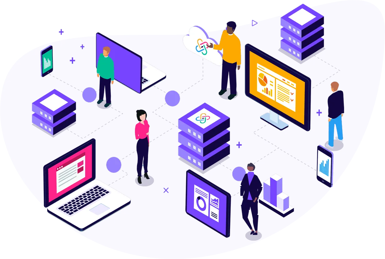
The illustration direction brings people, learning, and technology together. A shared palette and graphic style tie the scenes back to the identity.

Website design
The system,
brought together.
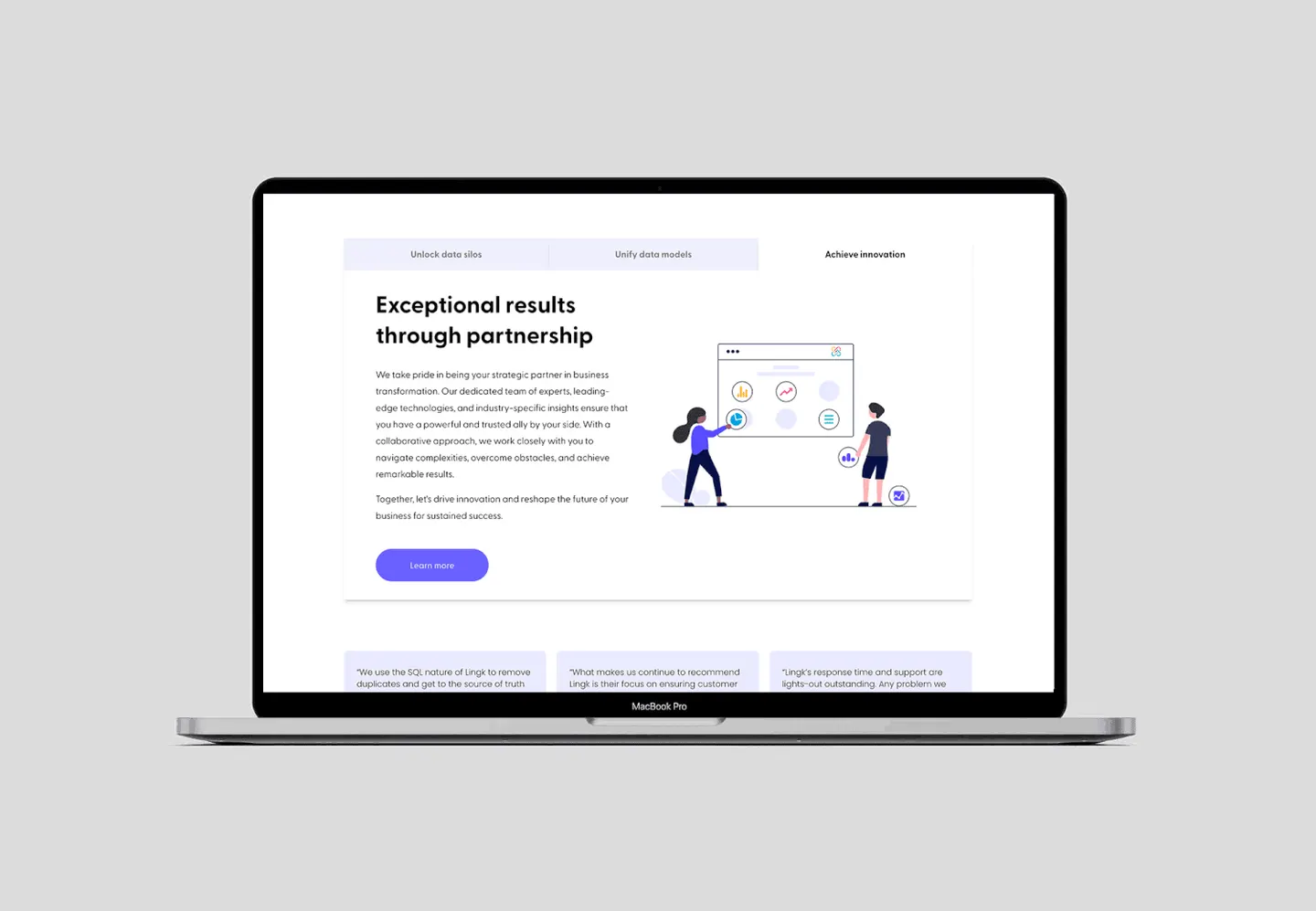
The website design combines clear content, colorful accents, and supporting illustrations in a cohesive digital expression of the brand.
Brand applications
A recognizable identity.
Beyond the screen.
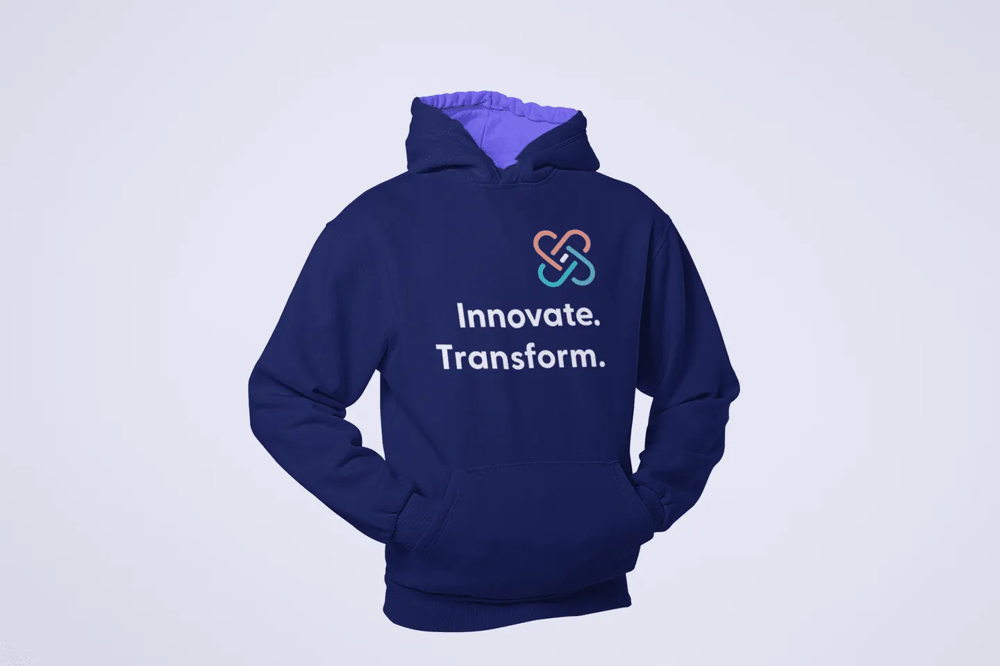
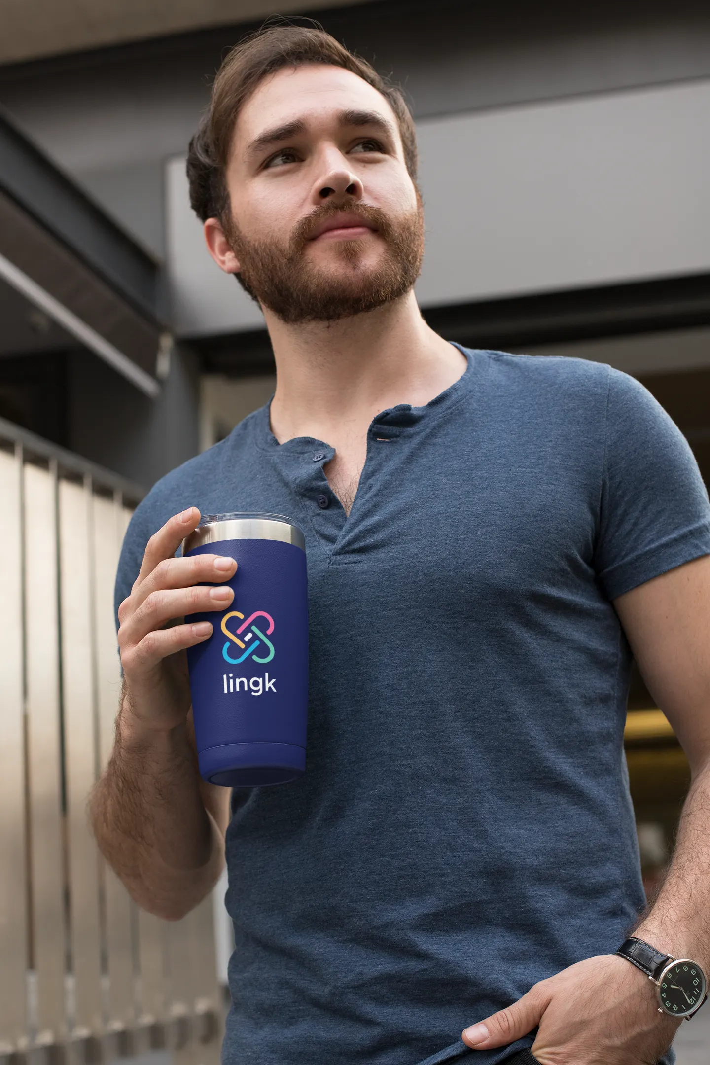
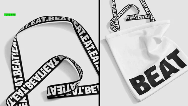
The mark and palette carry into branded merchandise, extending the same visual language into everyday touchpoints.